
Mix & Match: A Guide to Coordinating Outdoor Furniture Colors and Materials
Need a guide to coordinating outdoor furniture colors and materials? It all begins with understanding how color, texture, and tone work together outdoors.
Your patio is its own little ecosystem, shaped by the light, landscape, and the pieces you bring into it. And when you learn how all these elements interact, you’ll start to see why certain combinations feel balanced while others feel scattered.
This guide shows you how to build that harmony with confidence, whether you are working with bold hues, quiet neutrals, or mixed materials that bring depth to the space.
If you want an outdoor setup that looks intentional, feels welcoming, and stays true to your personal style, you are in the right place. Keep reading for a clearer, easier path to a polished patio.
Start With a Neutral Foundation for a Cohesive Outdoor Palette
Neutrals create clarity. When black, white, gray, or natural wood tones lead the layout, everything else has room to breathe. Besides, a grounded base gives your patio structure and makes other color decisions easier, especially if you plan to mix materials or experiment with bolder shades later on.
Begin by finding your anchor.
Black metal frames, charcoal wicker, or a deep brown wood set the visual weight of the entire space. Add white or off-white cushions for a contrast that feels bright without becoming stark. Then, layer gray through textiles and rugs to bridge the contrast and keep the palette feeling calm.
Texture brings warmth where color stays quiet. Woven rattan, stone surfaces, hand-touched ceramics, and subtle fabric weaves shift the mood from minimal to lived-in. Neutrals shine when they have something to interact with, and the right materials keep the scene from feeling flat.
Another advantage of a neutral foundation? It protects you from visual clutter.
If you typically prefer saturated colors or want seasonal flexibility, a stable backdrop makes bold accents feel intentional rather than overwhelming. A simple 60-30-10 ratio helps guide that balance:
Keep your core seating neutral at around 60% of the palette, supporting tones at 30%, and accents at no more than 10%.
This structure creates rhythm without restricting creativity.
Accessories should echo the base colors, too. When everything speaks the same language, these small pops of color feel expressive instead of chaotic. This approach works for everything from coastal and boho to modern and transitional styles because the foundation adapts to any direction you want to take.
As the day shifts, neutrals respond beautifully to changing light. As dusk lands, a fire bowl and string lights can pull the space together and set the stage for whatever color story you want to build next.
Use Color Theory to Build a Patio Palette With Purpose
Whether you lean toward minimalism, bold contrast, or soft gradients, the color wheel helps you translate the mood you want into a palette that feels intentional.
That’s where design becomes a tool for connection.
Color can set the rhythm of your gathering, create ease, or invite people to feel at home in outdoor spaces where everyone belongs. It’s time to choose your path:
Monochromatic harmony, complementary contrast, or an easy analogous flow.
Monochromatic Outdoor Harmony
A monochromatic palette creates a peaceful base that lets materials and craftsmanship step forward. You stay within a single color family and explore its lighter and deeper variations. Gray, olive, and sand are some of the most adaptable options, especially when you want your patio to feel calm and grounded.
The strength of a monochromatic approach comes from depth.
It’s unified, low‑maintenance, and quietly timeless.
Light gray cushions, a charcoal rug, and a soft greige throw all offer layers without competing for attention. Olive and moss tones bring organic stillness. Sand and taupe repeat the warmth of beach paths and sunlit stone.
In this scheme, texture carries the visual interest. Canvas weaves, rattan patterns, teak grain, and smooth metal finishes create the movement that color would normally provide.
Choose a base tone with staying power and let the supporting pieces shift around it.
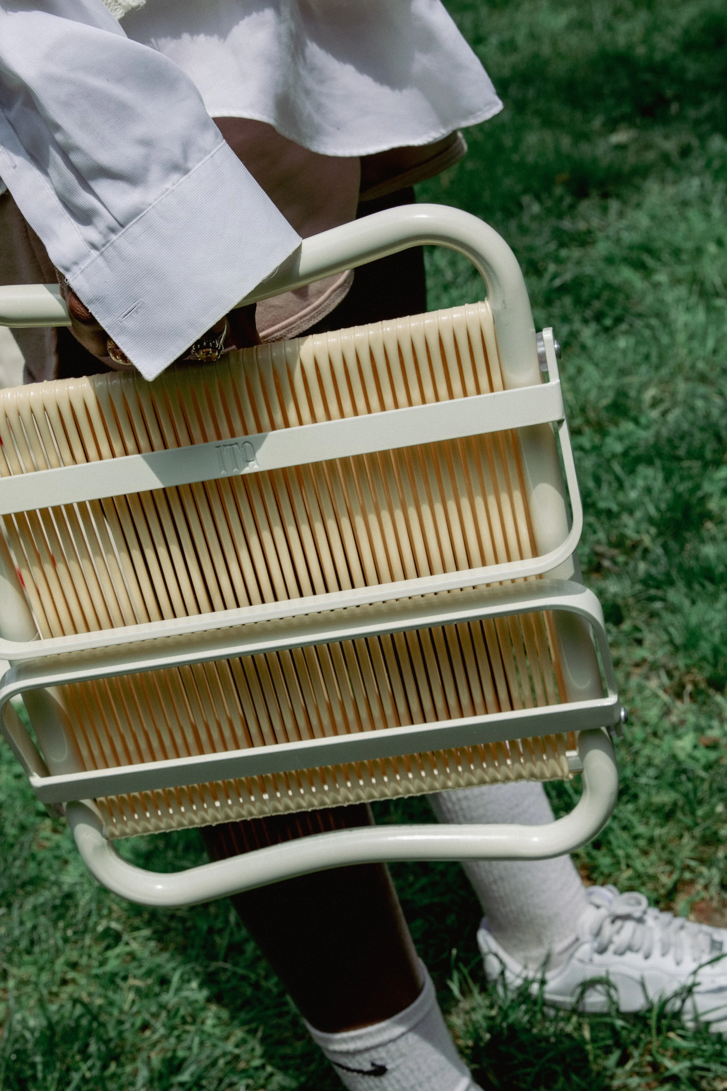
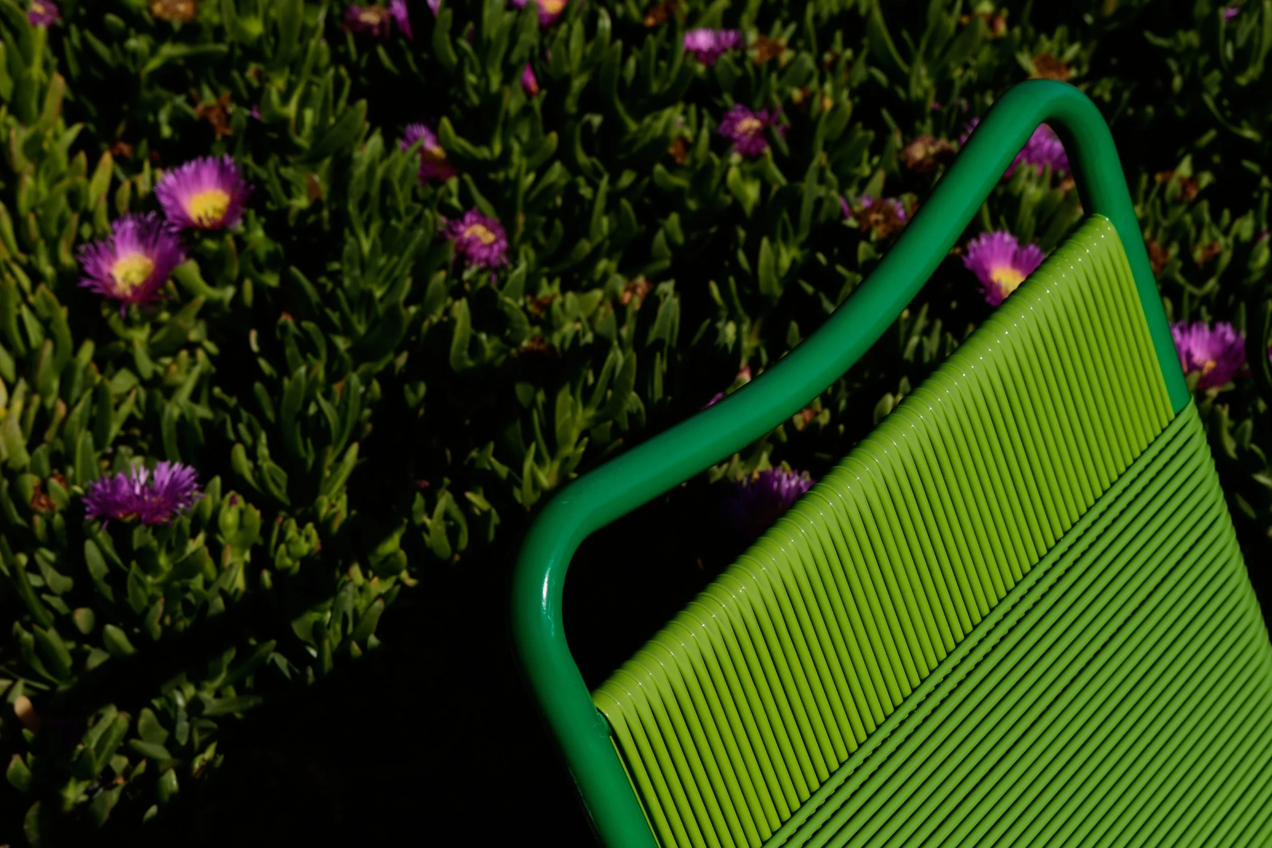
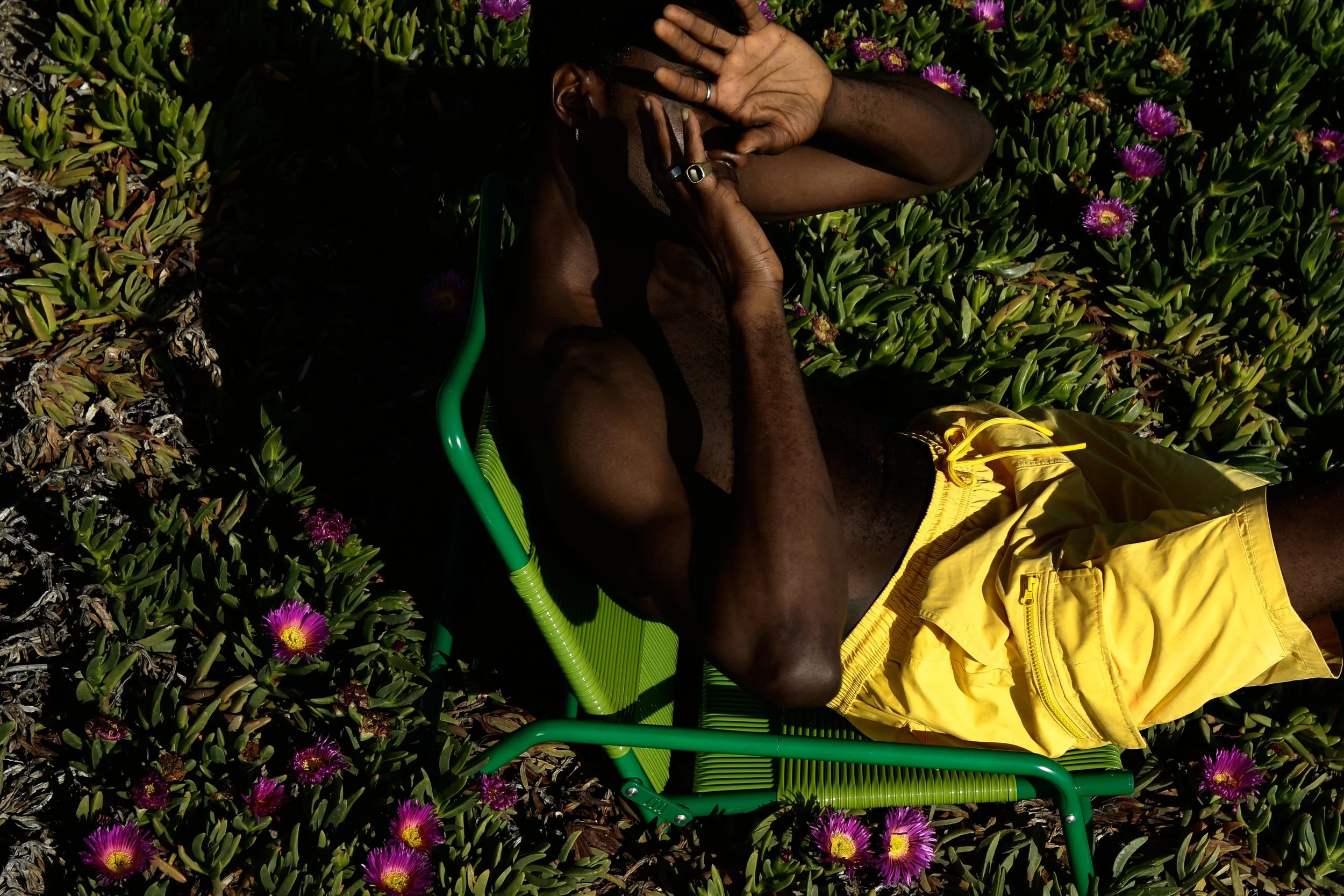
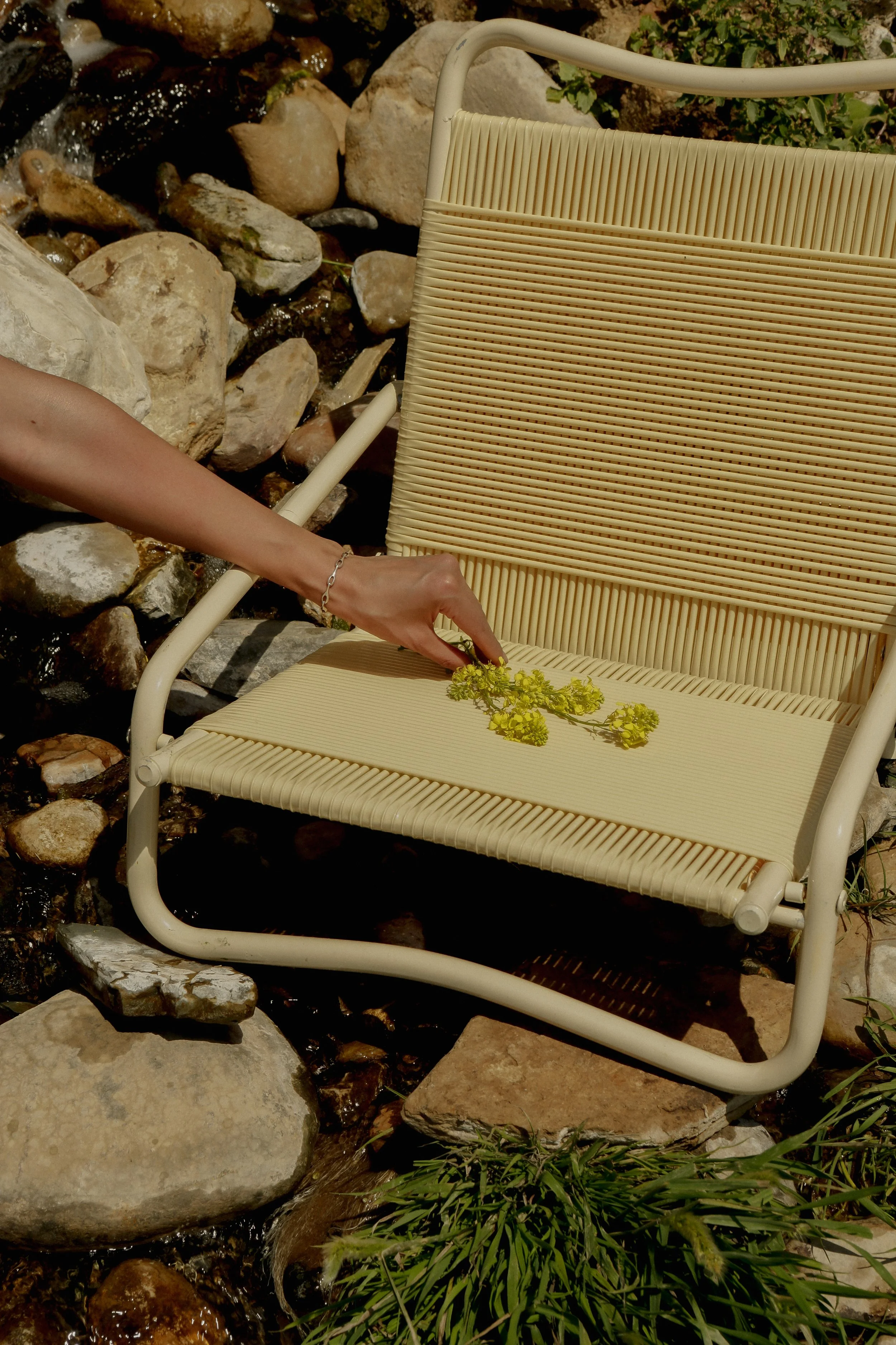
ITA’s Erupe Leisure Chair is an organic fit for your monochromatic palette because of the curved lines and sandy tone. The balanced mix of aluminum and PVC cord can bring depth without disrupting the calm of a single-color scheme.
Complementary Contrast Balance

Complementary palettes rely on colors that sit across from each other on the color wheel.
This combination can bring structure and energy to outdoor settings without turning them chaotic. When balanced well, complementary hues sharpen each other and create focal points that feel intentional rather than overwhelming.
So, choose one color to lead, give its complement a supporting role, and then let neutrals bridge the two.
Navy seating with white cushions and small orange accents feels crisp and bright. Pink and green combos bring garden-like vibrancy. Warm wood tones and matte black frames can steady the contrast and lower the intensity; you want a palette that feels usable in everyday settings.
Greenery is your natural buffer. Plants will soften contrasts and prevent complementary colors from feeling tense. When the palette aligns with nature, the space feels inviting rather than theatrical.
Analogous Palette Flow
Analogous palettes work with colors that sit next to each other on the wheel, moving the eye without a jolt.
Sea-glass blues, aqua greens, and deeper navy create a natural gradient that feels restful. These palettes are ideal for patios that blend with the surrounding landscape, especially in spaces with plenty of greenery, water views, or warm light.
Choose one color as your anchor, then let neighboring tones support it. Keep it to three to five hues; that’s harmony, not noise. Remember, textures become essential here. Linen slub, canvas weave, rope accents, and teak grain can help each tone shift smoothly into the next.
Analogous palettes often feel intuitive outdoors because they reflect what nature already does:
Sky to horizon, leaf to stem, wave to deep water.
They invite people to settle in and unwind.
Anchor your outdoor setup with ITA’s Beach Umbrella as a functional focal point. Its canopy blends easily with coastal and garden-inspired tones, helping anchor a gradient of blues, greens, or earth-based colors.
Coordinate Your Palette With Natural Surroundings and Existing Features

Every patio has its built-in palette. The plants, the soil, the siding, the paving stones, the sky above. When you echo these tones in your furniture and textiles, your space feels steady and connected to nature.
Coordinating outdoor furniture colors begins with an honest look at what already surrounds you:
Take note of the dominant colors in the environment, then look for supporting hues in your home’s exterior features.
Siding, shutters, planters, brickwork, railing, trim, and even the undertone of your deck can all guide your palette choices. When those elements work together, your materials and colors feel grounded across the entire outdoor footprint.
Echo Local Landscape Hues
Your surroundings can steer the palette more accurately than any trends could. The blues in coastal skies, the green of a backyard tree line, the muted beige of a dry landscape, or the rusty tones of clay soil are all natural starting points.
Matching those colors in your furniture helps your patio blend with the scenery instead of competing with it.
Remember that outside, green functions almost like a neutral. It pairs well with coastal blues, sandy tones, earthy browns, and warm terracotta.
Here are some ideas for echoing your setting:
Coastal spaces: Mineral blues, white frames, soft neutrals that mirror sky and sea
Desert: Ochre cushions, sand tones, terracotta planters, woven jute textures
Wooded or mountain areas: Deep greens, warm wood furniture, stone accents
Countryside: Taupe seating, clay-inspired tones, reclaimed wood surfaces
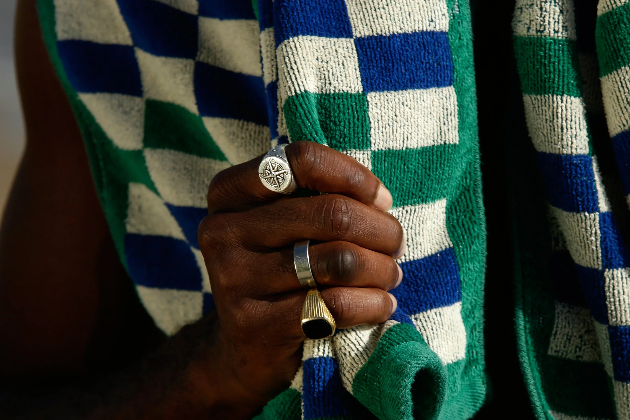
The ITA Terrain Beach Towel brings earthy, heritage-inspired tones that echo dunes, sunsets, and clay. Its highly absorbent, premium cotton weave and color scheme make it a natural extension of the surrounding landscape, especially in warm or desert-inspired settings.
When you let the land guide the palette, your outdoor space feels like an extension of the horizon.
Harmonize With Existing Accents

Once the landscape sets your direction, turn to the features already shaping your patio.
Work with what is already performing visually. The shade of your deck boards, the tone of your brickwork, the finish on your hardware, or the glaze on your planters can all anchor your design.
Look for one or two elements that repeat naturally.
If your railing leans cool gray, for example, let that color reappear in cushions or a rug. If your planters are terracotta, weave that warmth into a table accent or throw pillow.
Harmonizing with what you already have can reduce visual noise and bring your entire outdoor area into rhythm. The result?
An environment that feels rooted, balanced, and welcoming to everyone who steps into it.
Choose Materials and Finishes That Mix Well
A well-balanced patio blends materials in a way that feels intentional and grounded.
Wood brings warmth, metal adds structure, and wicker softens the scene with texture. But when these are all combined with purpose, they create a layered look that feels elevated rather than crowded.
Start by selecting one material as your anchor.
Teak, eucalyptus, and other hardwoods take the lead, mainly because they age beautifully and pair well with metal and wicker. Powder-coated aluminum and wrought iron frames can provide a clean silhouette that complements woven elements. Resin wicker introduces movement and tactile detail that offsets smooth tables or metal armrests.
Aim for a composition where the proportions feel harmonious.
A common approach is to let one material cover most of the footprint, support it with a secondary surface, and keep a third material as your accent. This balance prevents any single element from dominating the space.
Coordinate finishes so the palette stays unified.
Echo color cues across materials to help the mix read as cohesive. For example, warm wood can be repeated through tan wicker or soft earth-toned textiles, while cool-toned metal works well with gray wicker or charcoal cushions. These subtle connections help the entire setting feel curated.
Modern outdoor design celebrates mixed materials. So, do not hesitate to combine contemporary metal frames with woven seating or rustic wood with streamlined side tables. The goal?
Create an outdoor room that feels collected rather than matched, where each material supports the others in tone, proportion, and purpose.
Step back at the end. Does the mix look effortless? That’s how you know you have a coordinated material palette that will hold up beautifully through the season.
Mix Solids, Patterns, and Weaves Without Overwhelming the Space
Patterns bring life to an outdoor setting, but the key is knowing when to introduce them and how to keep the mix controlled.
Start with a solid foundation.
Anchor the scene with a unified base of solids across seating, umbrellas, or throws. Once the main color story is clear, add patterns that support the palette rather than compete with it.
Introduce patterns with intention.

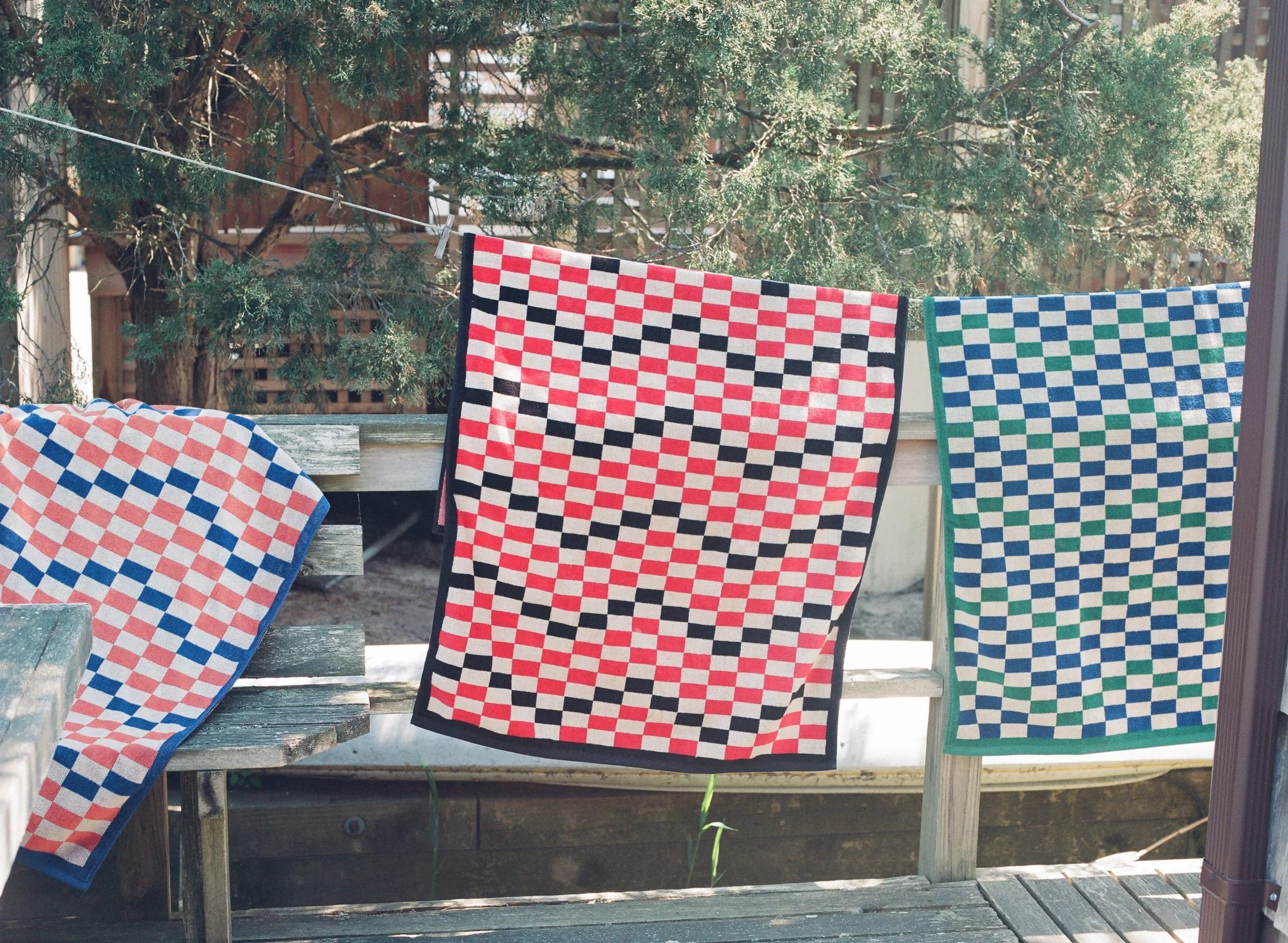
One hero print is enough to establish character; think wide stripes or bold botanical. Medium-scale patterns like checks and geometrics work well as secondary accents that help bridge colors across the space. Smaller motifs should be used sparingly here; you want to bring a subtle rhythm without increasing visual noise.
Three pattern types are usually enough for an outdoor area.
A stripe, a botanical, and a geometric can exist together comfortably when they share at least one common color thread. That repetition results in a flow that keeps the overall look balanced. A blue stripe on an umbrella can connect to a geometric throw in the same hue, while a third pattern, like a small-scale botanical, can add softness while staying anchored in the palette.
Texture matters as much as pattern.
Smooth fabrics typically pair well with woven details, like rattan, jute, and resin wicker. Metal trays, ceramic side tables, or stone planters can all act as grounding elements that prevent the patterned pieces from feeling weightless. Think of texture as a stabilizer that holds the visual mix together.
Keep your materials and patterns in conversation with the setting. A coastal space should lean into breezy stripes and washed blues, while garden settings usually welcome botanicals and soft geometrics that echo surrounding greenery.
Simply put, patterns should feel like an extension of the environment, not an interruption.
Timeless Outdoor Color Combinations That Always Work

Some color combinations remain dependable year after year because they’re rooted in balance, contrast, and the way the eye reads harmony outdoors.
They work across styles and settings, from coastal balconies to garden terraces, and can give you a clear starting point when coordinating your furniture, accents, and materials.
Blue and White
Blue adds some cool depth and pairs naturally with white, which reflects light and keeps the space feeling airy. This combination works especially well in coastal or bright locations where you want a clean, relaxed atmosphere. You could add interest through stripes, rugs, and tableware; they’ll pull both colors into one focal point.
Red and Black
This confident combination delivers contrasts and energy. Black acts as a stabilizer that frames the setting, while red introduces warmth and focus. Use red in controlled amounts on planters, tabletop accents, and textiles to keep the look refined. Think matte black furniture with red ceramics; it feels confident, not loud.
Each of these combinations can serve as a foundation for your outdoor palette. Once the base pair is set, layer textures, patterns, and materials that echo the same tones, so the entire setting reads as intentional and cohesive.
Bringing Your Outdoor Story Together
When your colors feel connected and your materials feel lived in, your outdoor space starts to tell its own story.
It becomes a place where afternoons linger and evenings unwind, shaped by choices that reflect who you are and how you rest.
If you’re ready to bring that story to life with pieces made for real relaxation, explore the ITA Leisure Shop, and you’ll find designs rooted in culture, comfort, and the belief that everyone deserves a place to breathe outside.